
|
4/26/2022 Market commentaryThe last few days, and in fact this whole year so far, has presented some volatility and periods of market decline that may come as a surprise to those who have gotten accustomed to prices only "going up". This post seeks to put the current market in a broader context and share some of my thinking about what may be ahead of us. 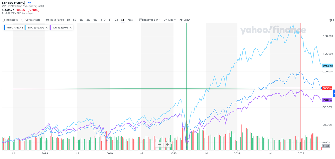 This chart shows the last 5 years of market movement for the S&P 500, Dow Jones, and NASDAQ indexes. The green vertical line shows the approximate worst levels of the early COVID related market crash, and the red vertical line shows the highest level on the S&P. As of this writing, the S&P is down about 12% from that high. The 5 year picture, and the YTD picture taken together provide some interesting context. Our experience is that the market can be volatile, with significant swings in price, and looking at too narrow a slice of time can be very misleading. It is a bit wild to see how much the markets grew during the COVID pandemic. 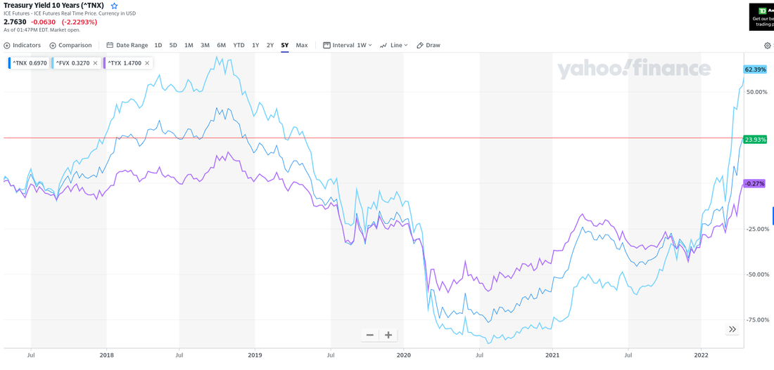 This second chart shows the path of interest rates over the last 5 years, specifically the rates for the five, ten, and thirty year US treasury bonds. The horizontal red line shows the current level of the ten year treasury. Many parts of our economy price off of the treasury market; corporate and municipal bonds, for instance, will generally yield some amount over the treasuries of similar term. Mortgage rates also tend to follow the treasury market, particularly the ten year yield. So a chart showing rates in the rest of the bond and mortgage markets would generally have the same shape. Bond prices move inversely to their yields, so this year-to-date has been very rough on bond prices and funds...at the same time that stocks have sold off. Historically the relationship between stocks and bonds has varied, but in the era of Fed and US government "stimulus" programs to ward off the worst outcomes during the "great recession" and now the COVID era, stocks and bonds have been trading together more often. So what is coming next? 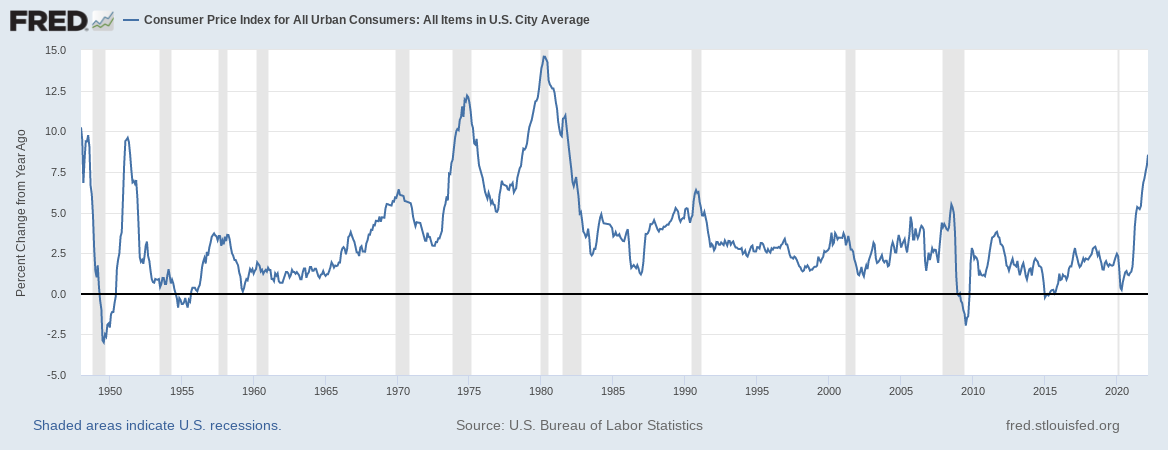 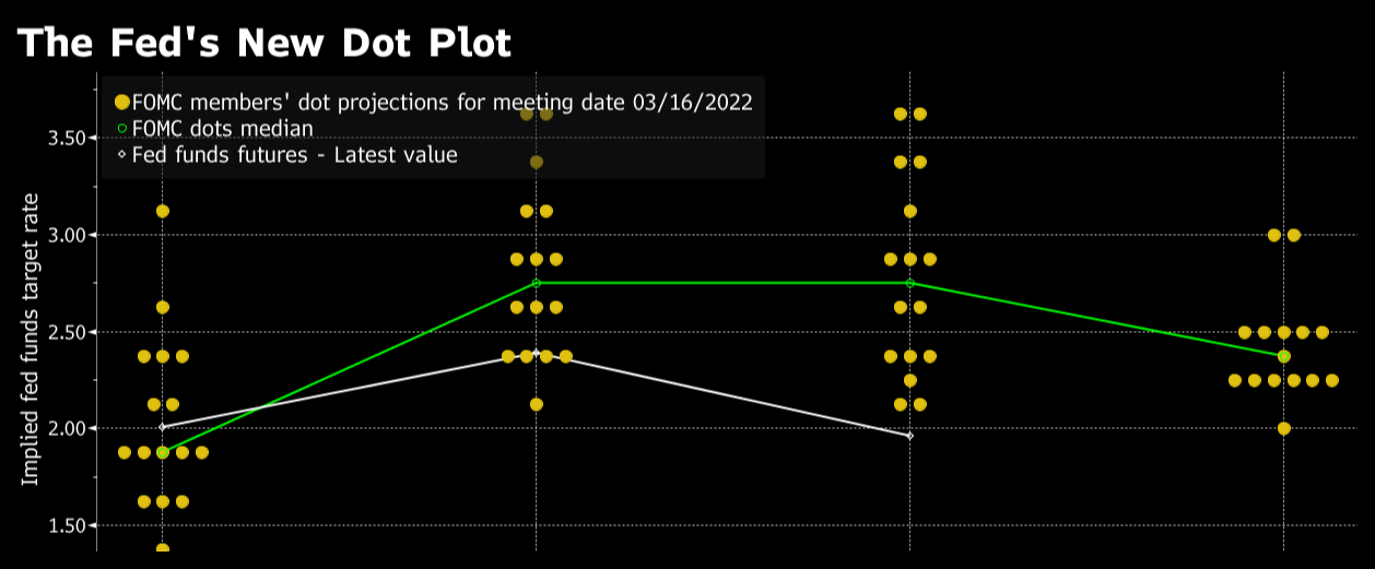 These two charts are related -- the first is a graph of the main measure of US inflation, and the most recent spike has been in the news headlines and on our grocery store receipts. The second chart (from the Bloomberg article linked below) is the so-called "dot plot" projecting the Federal Reserve's likely path for their interest rate targets. When the Fed raises rates, the short end of the treasury market will follow suit...or, in our current case, the treasury market will move in anticipation of the Fed. The current dot plot suggests that the Fed may eventually raise rates into the ~ 2.5% range. If inflation readings keep coming in hot, the Fed will likely adjust their target even higher. 2.5% is high relative to the recent levels near 0% that were put in place to stimulate / protect the economy, but is not high relative to the long term average. Taken all together, this data paints a picture that to me suggests a few things:
My investment management approach will likely continue to follow the pattern: an asset allocation model that includes stocks and bonds and cash in proportion to the individual client's capacity for risk and investment goals. This approach has historically offset some amount of volatility and maintained the potential for economic returns over time. I am available to discuss the particular advice and investment allocation for a given client on request. Historical returns do not guarantee future returns. This post is not intended as advice or a solicitation of any kind. Dot Plot article: https://www.bloomberg.com/news/articles/2022-03-16/the-fed-s-new-dot-plot-after-its-march-policy-meeting-chart
Comments are closed.
|
AuthorDavid R Wattenbarger, president of DRW Financial Archives
June 2022
Categories |
 RSS Feed
