|
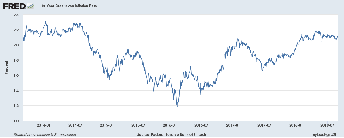
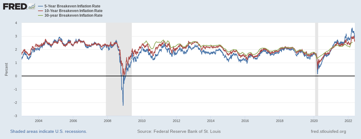
9/11/2018 Insights from the bond marketMany investors recognize that the bond market provides an opportunity for asset class diversification, but what may go unappreciated are the insights that bonds can provide for investments in the stock market. There are three data points in particular that can be useful for investors building portfolios in stocks. Inflation crossover rate The actual rate of inflation that an investor experiences over their investing timeline has enormous consequences for their economics; at a minimum, investors hope and plan for a return on their money that matches inflation to maintain their purchasing power. When making return projections for a given investment goal, like retirement savings, it generally makes sense to apply an assumption for the rate of inflation over that period. Investors can use historical inflation data, or the most recent measure, or can make a guess about what is likely to happen in the future. When making a guess about the future, the bond market may provide a helpful insight. The “breakeven rate”, which measures the difference in yield between a point on the yield curve between traditional treasury bonds and inflation indexed treasury bonds, captures in one number the bond market’s anticipated inflation for that period. This image shows the breakeven rate at the 10 year spot on the curve: Federal Reserve Bank of St. Louis, 10-Year Breakeven Inflation Rate [T10YIE], retrieved from FRED, Federal Reserve Bank of St. Louis; https://fred.stlouisfed.org/series/T10YIE, September 5, 2018 The most recent value of 2.08% suggests the bond market currently believes that to be the likely annual inflation rate over the next ten years. Risk free rate Approaches to valuation for stocks like the Capital Asset Pricing Model and mathematics to analyze options like the Black-Scholes model require an input for the “risk free” rate. Investor preference can dictate what rate they choose for this purpose; the 3 month T Bill rate is often useful due to the regular supply via Treasury auctions, the minimal duration risk, the high liquidity, and the full backing of the United States government credit quality. Board of Governors of the Federal Reserve System (US), 3-Month Treasury Constant Maturity Rate [DGS3MO], retrieved from FRED, Federal Reserve Bank of St. Louis; https://fred.stlouisfed.org/series/DGS3MO, September 5, 2018. Viewing the change and volatility in the chosen rate over time can also help inform expectations for the stability of the model. For example, in the CAPM calculations, a 3 month T Bill rate at 1% implies a very different value for a subject stock than the same rate at 2%. Shape of the curve The “yield curve” is made up of treasury bills, notes, and bonds with maturities ranging from a few days to as much as thirty years. The historically normal shape of this curve slopes upward, with the shortest bonds showing yields that are relatively lower than bonds with longer maturities. There are different theories for why the curve is normally shaped in this way, with implications for investor preference and opinions about risk, but for decades the typical relationship between spots on the curve is that longer maturity bonds yield more than shorter, with the amount of difference rising and falling over time. When the curve deviates from the historical norm, and either “flattens” to where there is little difference between the yields at different spots on the curve, or “inverts” to where shorter rates yield more than longer rates, there may be serious implications for the economy and for the stock market. The image below shows the 10 year treasury rate minus the 2 year treasury rate for the last ten years. Over that period, the spread between the two has bounced around a considerable amount, and in the last few months has shrunk to about 0.25% Federal Reserve Bank of St. Louis, 10-Year Treasury Constant Maturity Minus 2-Year Treasury Constant Maturity [T10Y2Y], retrieved from FRED, Federal Reserve Bank of St. Louis; https://fred.stlouisfed.org/series/T10Y2Y, September 4, 2018.
Market participants may read many portents into a flattening or inverted yield curve. Some common concerns are that a curve that deviates from the norm in this way suggests that a recession is likely in the near future. A more concrete view is to consider how the actions of the Federal Reserve propagate out through the bond market. In the recent case, the Fed has raised their funds target several times, which led to the short end of the market rising too (see the 3 month Bill rate above). The points on the curve further out, such as at the ten year and thirty year spots, have not yet priced in the likelihood of higher inflation or the Fed funds target to sustain in the current range. So the short end yields are up, but the longer yields have risen less on a relative basis; this leads to a flatter curve. Notes and disclaimers The Federal Reserve Bank of St. Louis provides an excellent resource for economic data; the charts and figures for this article are all sourced from FRED. This article is intended for educational purposes only, and is not a solicitation to buy or sell any security or investment. Investors should consult with a qualified professional, and carefully consider the risks and potential rewards of any investment strategy prior to making an investment. |
AuthorDavid R Wattenbarger, president of DRW Financial Archives
June 2022
Categories |


 RSS Feed
